If your travelers can’t find a great option in under 30 seconds, you’re already losing them. The mandate for modern travel booking UX is simple and measurable: reduce time-to-first-result and lift search-to-booking conversion. That means stripping away friction, exposing the right choices sooner, and proving trust at every step. In this guide, we’ll show you how to build a Travel Booking Website That Actually Gets Bookings through intuitive navigation, responsive design patterns that respect real thumbs and real networks, and data-informed decisions validated by user tests, not hunches.
You’ll get seven practical, field-tested tactics that compound: from goal-first information architecture that shortcuts to results, to assistive features that feel helpful, not creepy. Think typo-tolerant search that anticipates intent, comparison layouts that make trade-offs obvious, and transparent pricing that calms nerves before checkout. Each “secret” is designed to shave seconds, reduce cognitive load, and convert hesitation into commitment so users stop browsing and start booking. Ready to turn intent into revenue? Let’s build the travel experience people trust with their next trip.
1. Streamline Navigation with a Goal-First IA

Start with the journeys that matter most: Search, Compare, Book. If you’re serious about How to Build a Travel Booking Website That Actually Gets Bookings, anchor these paths in the global header and reinforce them with sticky CTAs that adapt as users scroll. For example, on a results page, the primary button should shift from “Search” to “Select room” or “Choose flight,” then to “Continue to checkout” as intent crystallizes. This reduces decision fatigue and nudges users forward without forcing them to re-orient. Treat secondary items — deals, inspiration, loyalty — like supporting acts that never compete with the headliners.
Make labels brutally clear and consistent. “Flights,” “Stays,” “Cars,” and “Packages” beat clever copy every time for task clarity, especially in a mobile-first booking flow. Map your IA with predictable paths and test it with tree testing before you ship — then validate in-product via task-completion studies (e.g., “Find a refundable hotel under $200 near the conference venue”). Watch for where users hesitate or pogo-stick between pages; those are signals to flatten the path or surface actions in context. As a rule, any journey that takes more than three taps from the homepage deserves an IA rethink.
Minimize clicks to results by putting common decisions up front. Pre-expose top filters (Free cancellation, Price, Rating, Breakfast included) and let users toggle them before running a search. Show popular routes and near-term dates (“NYC → LAX this weekend,” “Paris 3 nights next month”) to reduce form fill and spark momentum. For destinations with strong seasonality, use dynamic defaults guided by demand data so the first query is often the right one. This approach is pure conversion rate optimization: fewer inputs, faster time-to-first-result, higher likelihood to continue.
Support all of this with a visual hierarchy that clarifies where to look and what to do next. Use contrast, spacing, and placement to make the primary action unmistakable, and reserve the header for global wayfinding while delegating filters and sorting to a persistent, context-aware panel. On mobile, a bottom sheet for filters and a sticky “View results” CTA keeps progress visible without crowding content. Iterate ruthlessly: instrument every step, A/B test label variants, and prune navigation items that don’t earn their keep. The payoff is a site that feels intuitive on first use and gets users to the right result faster — exactly what it takes to build a travel booking experience that actually converts.
2. Frictionless Search with Smart Defaults and Autofill
Turn the search bar into a decision shortcut, not a data-entry chore. Pre-fill dates intelligently — “next weekend” for leisure intent, auto-expanding to “Fri–Sun,” or a seven-night default for beach destinations where longer stays are common. Remember recent searches and persist them across sessions and devices so users can resume in one tap. In well-tuned search and filter design, these micro-optimizations shave seconds off every query and compound into lower abandonment and faster time-to-first-result.
Reduce ambiguity at the source. Use location detection to offer a “Near me” starting point and disambiguate inputs like “Paris” with smart chips that clarify city vs. airport (e.g., “Paris, France • City” vs. “CDG • Airport”). Typo-tolerant search (fuzzy matching for “Barcelna” → “Barcelona”) and IATA code recognition (“SFO,” “LHR”) make power users feel seen while catching common errors for everyone else. As users type, stream instant, ranked suggestions that blend destinations, stays, and experiences — complete with thumbnails, starting prices, and quick tags like “Free cancellation” or “Great for families” — so choices feel obvious before a full results page even loads.
Design your autosuggest panel like a mini results page that earns trust. Include lightweight trust signals and social proof directly in the dropdown: “Highly rated (4.7) • 2,100 reviews,” “Booked 24 times today,” or “Verified host.” This lowers decision anxiety early and reduces pogo-sticking. Keep everything snappy with speed and performance optimization: prefetch likely routes, debounce keystrokes, cache popular markets at the edge, and load critical suggestion data via a low-latency API. When the experience is instant and informative, users stop second-guessing and start exploring.
Finally, make autofill work for the booking, not just the form. Pull traveler counts from prior trips, suggest flexible-date toggles when inventory is tight, and elevate nearby airports if they unlock cheaper fares. On mobile, couple this with large tap targets and bottom-sheet calendars that expose “+/- 3 days” options without modal fatigue. Test aggressively: measure reductions in edit rate, null-searches, and time-to-first-result, and correlate improvements to search-to-booking conversion. That’s how frictionless search becomes a conversion engine, not a feature.
4. Visual Hierarchy that Inspires and Clarifies
Lead with images that do the heavy lifting, then let scannable cards do the rest. Hero photos should immediately communicate setting and vibe (e.g., rooftop pool at sunset vs. mountain trailhead at dawn), while cards surface the “make-or-break” details without a click: total price, refund window, neighborhood, and two to three signature amenities. Use consistent iconography and microcopy to keep cognition low — if “Free cancellation” is always a green shield and “Breakfast included” is always a plated icon, users learn faster. On mobile, pair edge-to-edge photos with a top-aligned price and a bottom-aligned shortlist of amenities so thumbs never have to hunt; A/B test whether price-per-stay vs. price-per-night reduces bounce.
Typography, spacing, and contrast are your steering wheel. Establish a typographic scale that lets eyes “ladder” down a card in three beats: title (where), price (how much), essentials (why). Use 8pt spacing increments to create a predictable rhythm and meet WCAG contrast ratios so information remains legible in bright travel conditions. Strong contrast isn’t just accessibility — it’s conversion; crisper hierarchy helps users scan more results per minute. When something goes wrong, apply the same hierarchy rules to error handling and validation: concise inline messages beside the field, a clearly contrasted border, and a small helper line with a fix. Visual clarity in errors keeps momentum, which is critical mid-search.
Design for comparison like it’s a core feature, not an afterthought. Grid layouts with aligned columns let users compare apples to apples — price, rating, distance, and cancellation policy in the same row order. Use visual highlights and badges to collapse complexity: “Best Value Tonight,” “Family Favorite,” or “Walk to Metro (3 min).” Dynamic badges can also support personalization and recommendations by promoting attributes users actually care about (e.g., pet-friendly for pet owners, early check-in for business travelers). Consider a compare tray that pins selected options and spotlights deltas (fees, breakfast, bed type) so decisions become obvious at a glance.
Finally, guide attention with subtle, helpful cues rather than noise. During onboarding and guided flows — for instance, a first-time user exploring Paris — progressively reveal filters and teach the interface with micro-tooltips (“Tap to see flexible dates”). Keep supporting content secondary: reviews summarized as distributions with a single standout quote; map previews as small chips that expand on tap. Maintain a persistent, low-contrast summary bar that updates selections in real time, reducing context switching. Across all of this, treat hierarchy as the connective tissue between content and action — every pixel should help travelers decide faster and with more confidence.
5. Trust Signals and Transparent Pricing to Reduce Anxiety
Trust is a conversion multiplier, especially at the moment of commitment. Put decision-grade signals exactly where choices are made: on search cards, the compare view, and above the primary CTA. Instead of a single star average, show a ratings distribution (e.g., histograms with filterable tags like “quiet,” “walkable,” “great Wi‑Fi”) and clearly marked verified photos so users can assess quality at a glance. A small but powerful pattern: a “Reviewed by similar travelers” chip that adapts to the user’s context (family, solo, business). In content design and microcopy, replace vague claims with evidence (“2,341 verified stays in the last 6 months”) and plain-language highlights (“No resort fees. Free cancellation until 24 hours before check‑in”). This is How to Build a Travel Booking Website That Actually Gets Bookings — by making proof effortless to find.
Price clarity must start early — on the results list, not just the checkout. Show the true total with taxes and mandatory fees, and let users tap for a simple breakdown (“Room $180; Taxes/Fees $32; Total $212”). Consider an inclusive pricing toggle that remembers preference, and preview the total cost dynamically as users interact with calendar and date picker UX; nightly rate changes and weekend surcharges should be obvious before a date is selected. Use receipt-style summaries that update in real time as guests, dates, and add‑ons change, and pair them with concise policy microcopy (“Full refund until Aug 21, then 50%”) linked to a scannable policy sheet. Many teams find via A/B testing for travel sites that moving “total price” onto the card and clarifying policies near the CTA reduces backtracking and increases add‑to‑cart rate.
Reinforce credibility during checkout without adding friction. Display recognizable security badges (PCI, TLS), trustmarks from payment providers, and offer modern options — Apple Pay, Google Pay, regional wallets, and pay‑over‑time with transparent APRs. Keep social proof helpful, not pushy: “Booked 14 times today” or “Last reserved 2 hours ago” is useful when throttled and sourced from real activity; avoid fake urgency. If your property images are user‑submitted, mark them “Verified guest photo” and algorithmically surface a balanced set (great views and realistic bathrooms) to manage expectations. These cues reduce anxiety at peak-risk moments and can measurably cut checkout abandonment.
Finally, close the loop with instrumentation. Track how often users expand price breakdowns, interact with policy links, or filter by rating tags, and feed those insights back into design. Run A/B testing for travel sites on review placement, total-price prominence, and the wording of cancellation microcopy to quantify lift in search‑to‑book. The pattern that wins is consistent: make proof visible, keep pricing honest, and let reassurance travel with the user from search to confirmation. That’s the practical path to trust — and to a travel experience that converts.
6. Booking Flow That Removes Friction, Not Control
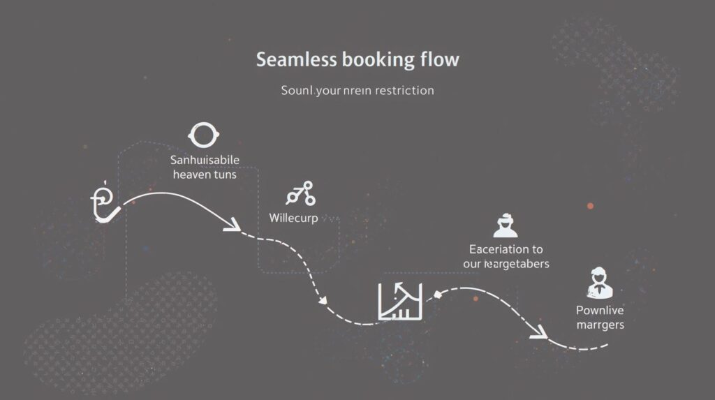
Treat the booking flow like a guided conversation: start with essentials, then reveal the rest at the right moment. Use progressive disclosure to collect must-haves first — dates, guests, destination — then defer add‑ons like seat selection, breakfast, or insurance until there’s clear intent. Summarize choices inline as users go, so they never feel locked in; a collapsible “Your trip so far” panel that updates live with dates, room type, and refund policy keeps context without forcing a page change. This approach preserves momentum while maintaining a sense of control — customers can opt into extras intentionally, rather than feeling upsold.
Reduce input effort wherever possible. Auto‑validate fields in real time with country‑aware rules (e.g., phone formats, passport patterns), and support autofill for traveler details from the browser, plus wallet options like Apple Pay, Google Pay, and PayPal to accelerate payment. Make edit‑in‑place trivial: let users adjust dates or guests via inline chips or a mini date picker without losing progress. If a traveler adds a second guest, update room recommendations and total price automatically; if they change to carry‑on only, adjust baggage fees instantly. Every micro‑interaction that avoids a reload prevents second‑guessing and drop‑off.
Maintain pricing transparency throughout the flow with a persistent order summary that shows total cost — taxes, fees, and currency — alongside what’s refundable and by when. Use skeleton states and optimistic UI to keep the summary responsive as availability or promo codes are applied. A final review screen should feel like confirmation, not interrogation: show key details (dates, fare class, cancellation terms), surface trust signals (secure checkout badge, accepted payments), and allow a single click to fix any item. If you upsell, do so contextually — “Add breakfast to this refundable rate” — with clear value and no surprise recalculations at the end.
Continuously test how much to show and when. A/B test step count vs. conversion: some audiences prefer a single, scrollable page; others convert better with short, focused steps that build confidence. Experiment with guest checkout vs account creation prompts — offer account benefits (trip sync, stored documents, loyalty status) but never block a ready-to-book user. Post‑purchase is the moment to invite sign‑in with value (itinerary alerts, easy changes), not before payment. Instrument the flow end‑to‑end: measure time-on-step, error hotspots, and edit frequency to identify where friction hides, then iterate until the path from intent to confirmation feels inevitable.
7. Personalization and Assistive UX That Feel Helpful, Not Creepy
Personalization should feel like a shortcut, not surveillance. Start with intent signals users willingly provide — origin, dates, party size, and recent browse history — and turn them into context-aware helpers: flex-date toggles that instantly reveal cheaper ranges, nearby airport suggestions when savings cross a defined threshold, and “similar stays” that mirror amenities and vibe rather than just price. Make every nudge explainable (“Prices drop if you fly from SJC, 25 min away”) and controllable with clear opt-ins and frequency caps. When users understand the why behind a recommendation, acceptance and conversion climb without triggering privacy alarms.
Design for memory across moments, not just sessions. Let people save favorites and build lightweight shortlists, then offer a clean compare view that normalizes deal-breakers (beds, cancellation, total price) for apples-to-apples decisions. Sync state across devices so a route scoped on mobile can be finished on desktop — with a gentle, dismissible reminder rather than a hard-handed popup. A simple “Pick up where you left off” ribbon tied to last-seen filters reduces rework and shortens time-to-first-result — exactly How to Build a Travel Booking Website That Actually Gets Bookings.
Assistive tools should lower effort at the right moments. Price alerts that specify trigger logic (“Notify me if total drops below $550”) and flexible date grids that visualize trade-offs (cost vs. duration vs. stops) empower users to self-serve. Pair that with a lightweight chat that specializes in edge cases — multi-city quirks, infant-in-lap policies, visa timing — surfaced contextually when error rates spike or users hesitate. Keep chat scoped and fast with pre-filled context from the cart and recent actions to avoid repetitive questions and reduce abandonment.
Measure helpfulness, not just clicks: alert opt-in rate, suggestion accept rate, shortlist-to-booking lift, and the drop in time spent re-entering details. Use cohort-level models and on-device storage where possible to minimize data creep, and give users a transparent preference center to tune noise levels. The win-win is a system that anticipates needs without assuming too much — personalization that quietly accelerates the journey and assistive UX that rescues edge cases — so more travelers complete with confidence and fewer detour to competitors.
Turn UX Principles into Booking Performance
Every pattern in this playbook is only as valuable as the outcome it drives. Instrument the journey end-to-end and tie each design choice to measurable results: reduce friction by cutting time-to-first-result and form errors; build trust with transparent pricing, verified reviews, and credible badges; and lift search-to-book conversions by streamlining navigation, performance, and the booking flow. This is How to Build a Travel Booking Website That Actually Gets Bookings — where IA, search, mobile layouts, hierarchy, trust signals, and assistive UX work together to move users confidently from intent to purchase.
Now close the loop with iteration. Prioritize user intent, set clear KPIs (LCP, task completion, suggestion CTR, add-to-cart rate, checkout drop-off), and A/B test the micro-decisions — labels, defaults, steps, summaries — that compound into real revenue. When you continuously test, learn, and optimize the journey end-to-end, you don’t just design a nicer interface — you design a travel product that reliably converts.